This project was a pre existing design challenge. Melodi, a music streaming service, is shifting to a freemium model and wants to convert free users into paid subscribers.
Roles: User Research, Information Architecture, UX/UI Design, Prototype, Testing
Project Duration: 9 weeks
Melodi has decided to change to a freemium model and aims to convert free users into paid subscribers. However, the existing signup flow does not currently have compelling reasons to upgrade.
1. Enhanced Signup Flow: Redesigned signup flow for a user-friendly experience with eye-catching prompts to encourage upgrades.
2. Subscription Calls to Action: Integrated strategic prompts throughout the user journey to showcase premium benefits and features, boosting upgrade consideration.
3. Iterative Design Process: Continuously iterated design based on user feedback and usability testing, using wireframes and prototypes. Identified and resolved issues to enhance user experience and increase conversions.
Melodi aimed to boost conversions by implementing redesigned signup flow, strategic prompts, and compelling reasons to subscribe. The improved user experience successfully motivated users to upgrade, leading to increased revenue and user satisfaction.
Spotify
YouTube
After analyzing our competitors, I wanted to better understand the users. So, I conducted user interviews. To make sure I got consistent information from everyone, I created an interview guide with a set of questions. This helped me gather valuable insights from all participants. I conducted these interviews online using Zoom.
The insights gathered from surveys and interviews laid the foundation for creating Melodi's persona. These insights primarily revolved around identifying recurring patterns and pain points, which deepened my understanding and empathy towards users.
To accommodate users like Jane and Nicholas, I developed user flows to illustrate the various routes they might follow within the app. These flows show the choices and actions they can make, helping me understand their decision-making and any challenges they may face. Analyzing these flows has given me valuable insights into user behavior and areas that need improvement, guiding me in designing solutions that meet user needs and goals.
Following the user flows, I created low fidelity wireframes using Figma. These wireframes emphasized functionality and content layout, enabling quick iterations and feedback. This process allowed me to uncover usability problems and enhance the user experience before moving on to detailed designs.
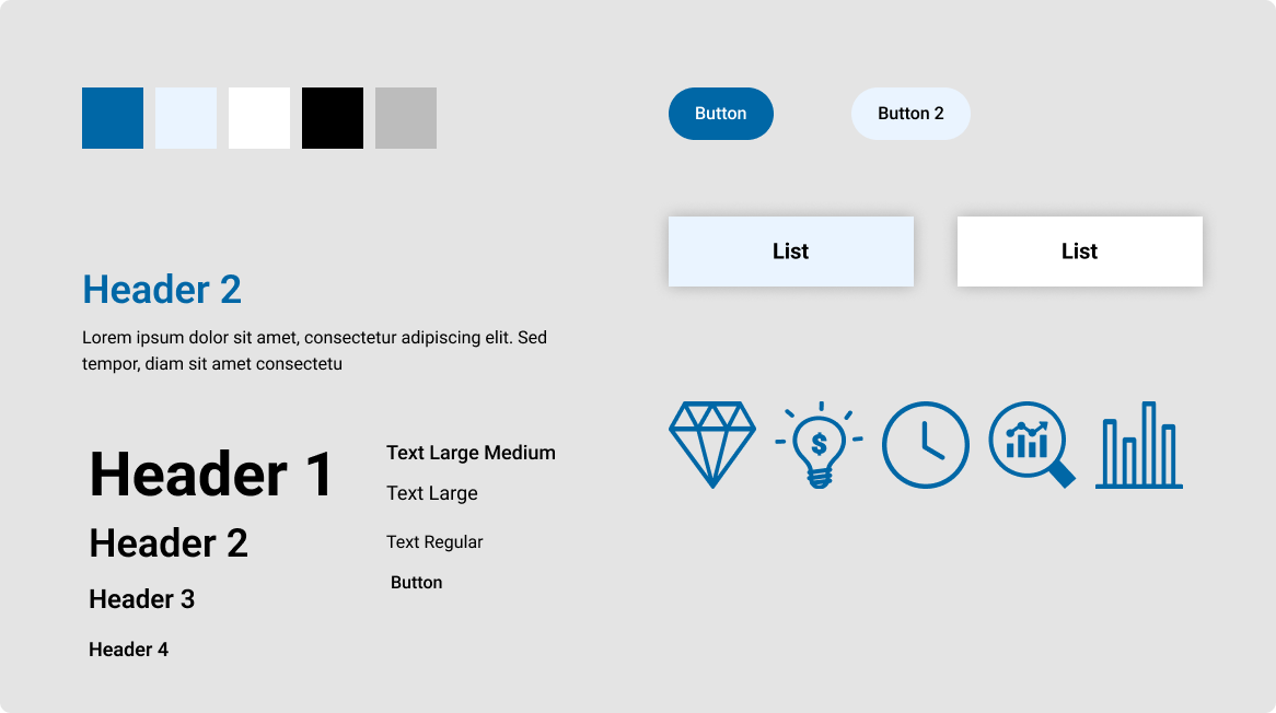
Following first round of usability testing, I created a design systems. The design system was developed to ensure consistency across the entire app. The chosen color palette consists of bold and hip pink and purple tones, which create a young and visually appealing aesthetic throughout the design elements.
Using the design system created previously, I created my high-fidelity wireframes before the second round of usability testing
I did a round of usability tests with 5 participants using the high fidelity wireframes. Here's what I found and what I changed based on their feedback.
This project was a design sprint with a pre existing design challenge. I chose PostUp. PostUp is a startup that wants to make it easier for freelance and remote workers to find spaces to work.
Roles: User Research, Information Architecture, UX/UI Design, Prototype, Testing
Project Duration: 1 week
“PostUp wants to make it easier for remote workers to find great public spaces to work.”
During interviews, users identified the qualities they desired in a work space:
Constraints:
After understand the problem, I took the knowledge that I acquired and mapped out some possible flows a user might go through using an app to find a space. Below is the three possible routes a user might take.
Before ideating, I did some initial research into existing platforms with similar informative processes in place. The two I decided to research are below:
Google Maps
AirBnb
After the competitor analysis, I proceeded to do the crazy 8's.
The crazy 8's is an exercise that challenges people to draw eight ideas in 8 minutes. I thought that the most important screen would be where the users look at the details of the locations.
Some difficulties I ran into was that the time constraints made me really have to think quick.
To the right are the eight ideas that I came up with.
Following the solution sketches, I created a six screen storyboard. By storyboarding, I was able to visualize, evaluate, and select the most promising idea generated from the previous solution sketches. It helped ensure that the solution sketches aligns with the user needs and project goals before moving forward with the final prototyping and testing stages.
On day 4, I used to Figma to create my wireframe of my sketches I created during storyboarding. The screens below are the screens before I performed a usability test.
After I created the prototype, I needed to test how user would interact with it. Therefore, I interviewed and tested 5 participants remotely. The participants had their own experience of difficulties finding places to work. All participants were asked some questions and to perform some tasks.
Tasks
Point 1: Participants emphasized distance as crucial.
Solution: Include distance from current location in the location details.
Point 2: Participants mentioned it was confusing where the current location was on the map. Also mentioned the map felt cluttered.
Solution:
Visualist, a cloud-based platform for managing images and color palettes, was in the beta testing phase before its official launch. At this stage, Visualist sought to redesign a particular feature on its platform: the block detail card.
Roles: User Research, Information Architecture, UX/UI Design, Prototype, Testing
Project Duration: 4 weeks
As Optonetic, a B2B company, primarily focused on sustaining existing client relationships. Recently, their goal was to increase potential clients by improving their online presence. They aimed to achieve this by improving the presentation of their services and products on their website. The objective was to make it easier for potential clients to understand the range of offerings and encourage them to reach out for more information or to initiate business discussion.
The existing Optonetic website was not able to clearly differentiate between its services and products. Outdated design elements and absent calls-to-action affected user engagement and was not able to effectively communicate Optonetic's value proposition to potential clients. Optonetic sought to address these issues and improve the overall user experience.
The proposed solution addresses these issues as follows:
During the competitive analysis, I observed that many direct competitors had seemingly outdated websites. While their information was straightforward, the aging demographic of engineers in the photonics industry (56% aged 40+) highlighted the need for modernization.
Lambda, for instance, offered detailed product specifications but lacked a clear call to action upon landing on their website. Consequently, I sought inspiration from different manufacturing companies, particularly Caldera Manufacturing, which presented a clear call to action, utilized complementary colors effectively, and employed icons for streamlined information display.
Lambda
Clardera Manufacturing
The redesign process started by mapping out user flows to guide users seamlessly from the homepage to specific sections like services, products, capabilities, and contact information. Services and products were clearly separated, while capabilities were split into two sections using a dropdown menu. This approach ensured an intuitive navigation experience for users.
During the sketches, I adopted a "crazy 8s" approach to sketching, allowing for rapid exploration of various design ideas. This method helped me generate of diverse concepts and layout options for the website redesign, encouraging creativity and innovation.
Following the sketcing session, I proceeded to create a low-fidelity design based on the sketch I selected.
Landing Page
Services/Products/Capabilities Pages
Design systems were established to maintain consistency across all website pages, including typography, color palettes, iconography, and 8px grid system.
Given additional time, I would focus on conducting usability testing sessions to identify any pain points or areas for improvement and making iterative changes to optimize the website's performance. Additionally, I would explore implementing additional features or functionalities to enhance user engagement and conversion rates, such as interactive elements.
Visualist, a cloud-based platform for managing images and color palettes, was in the beta testing phase before its official launch. At this stage, Visualist sought to redesign a particular feature on its platform: the block detail card.
Roles: User Research, Information Architecture, UX/UI Design, Prototype, Testing
Project Duration: 4 weeks
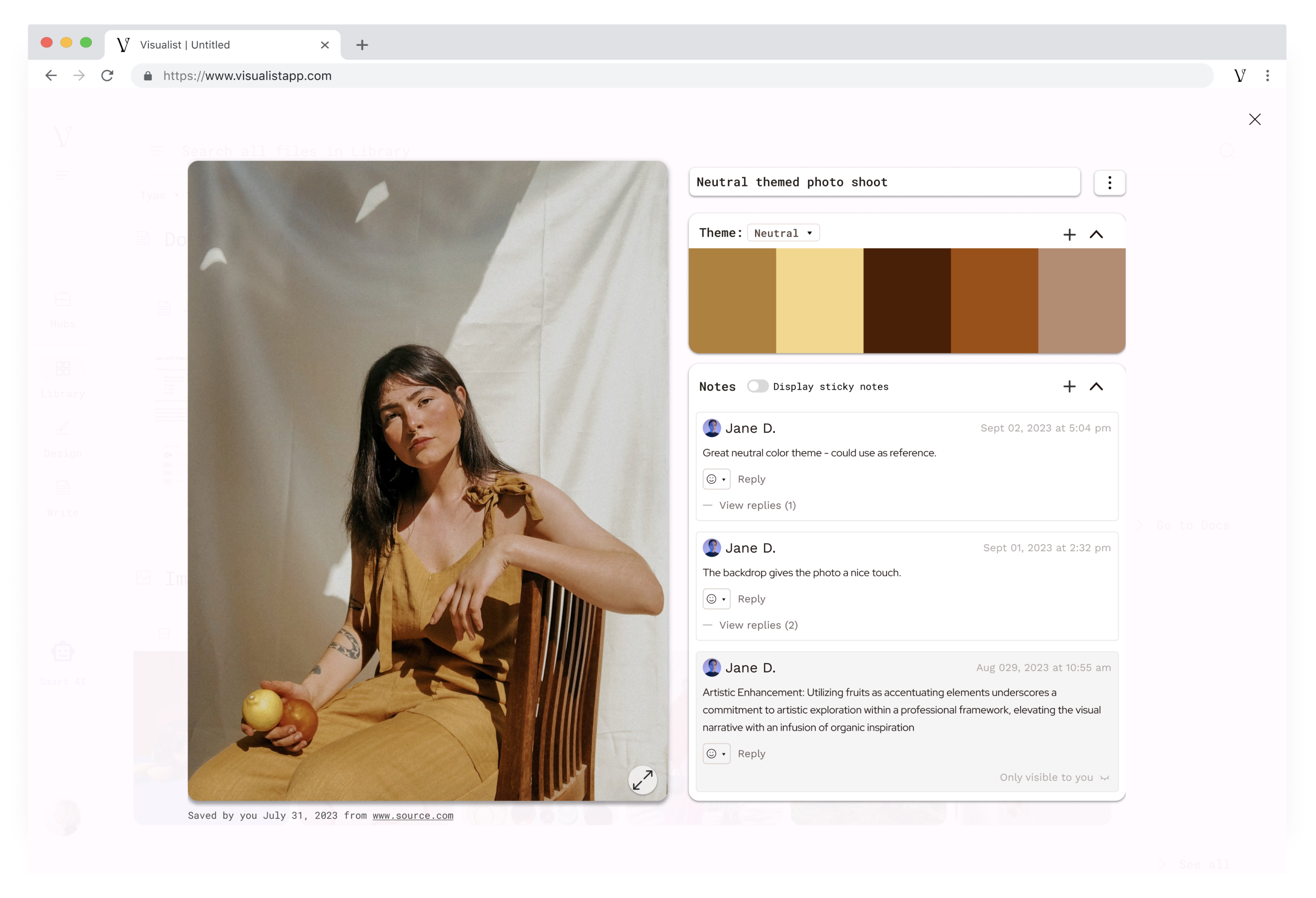
The block detail card is a component of the Visualist platform that presents users with an image accompanied by relevant information. It serves as a focal point for users to view and interact with content.
When the team was onboarded, we received feedback from previous testing indicating that users found the current block detail card cluttered. They expressed a desire for better note-taking capabilities and users were not engaging with certain features as much as they would like.
The proposed solution addresses these issues as follows:
We analyzed two competitors that , Milanotes and XTiles, which offer services similar to Visualist.
Milanotes
XTiles
We started by mapping the current user flow of the Visualist product to identify its problems. Using this analysis, we simplified the process by removing clutter and overwhelming features. Then, we developed a new user flow for our redesigned product.
Now with a good understanding of the space, our team conducted a Crazy 8's session. This fast-paced brainstorming exercise allowed each team member to generate eight quick design ideas for the block detail card in just a few minutes, providing fresh perspectives. Below are the four sketches I drew.
Following the Crazy 8 brainstorming session, I proceeded to create a low-fidelity design based on the sketch I selected.
After the brainstorming session, the team decided to create a sketch combining all our ideas. We simplified the user experience by removing unnecessary features and consolidating all information into a single, unified view. Instead of having separate tabs for Properties, Stickies, Edit, and Related, we aimed to enable communication through the use of 'stickies,' essentially functioning as comments on the image.
Using the sketch, we created a low fidelity wireframe. We introduced multiple options for users to declutter the card, such as the ability to minimize the color palette and hide comments.
Additionally, we placed the information to the bottom of the card.
Now that we had a interactive prototype, we moved onto usability testing. We tested 5 participants all closely related with the interior design industry. Below is the feedbacks and suggestions we received from the participants.
With the updated insights, our team received a revised version of the block detail card. Even though the project was completed, I decided to create a final solution independently, based on the revisions. Here is the resulting image, which includes the following changes: moved the color theme to the right to maintain visual coherence.
During our collaboration with Visualist, our goal was to refine the block detail card for an improved user experience.
What I learned:
Key Takeaways:
Introducing Expiretrak: Your solution for managing skincare product expiration dates. With vague labels like "expires 12 months after opening," it's easy to lose track. Expiretrak sends timely reminders so you never forget when you opened a product.
Roles: User Research, Information Architecture, UX/UI Design, Prototype, Testing
Project Duration: 12 weeks
Buying a variety of personal care products caused confusion of when the products were purchased or opened. In turn, caused confusion of the products expiration date or PAO (period-after-opening).
Create a mobile app that can offers a user-friendly platform that empowers individuals to easily organize and track their personal care items, ensuring they are used within their safe and effective shelf life. This can be accomplished by:
First, before touching anything related to design, I wanted to dive into the market and exposure of personal care products.
White paper research
Since this space of expiration date tracking did not seem too saturated, I wanted to explore what was currently working and what could be improved.
To start, I began with a competitor analysis to assess the existing products in the market. I evaluated three apps with similar functionalities based on Nielsen's heuristics. The evaluation focused on consistency and standards, aesthetic and minimalist design, and recognition rather than recall.
The competition lacked intuitive design...
With the newfound information from the secondary research, I wanted to get first hand information from my target audience through user interviews.
After the competitor analysis, I conducted a series of 5 interviews to gain user insight on tracking expiration dates for personal care products.
Goals:
1. To understand participants' habits and behaviors related to personal care product usage, including their awareness of expiration dates.
2. To identify any challenges participants face in tracking expiration dates and their attitudes towards using expired products.
3. To gather insights into participants' preferences for potential solutions or apps that can help them manage personal care product expiration dates more effectively.
After collecting the recordings from the user interviews, I conducted affinity mapping to synthesize the pains identified. I organized these problems under common themes.
Using the findings from the user interviews, I was able to create a persona with the themes from the affinity map.
I created a scenario that Jennifer (the persona) would encounter while keeping track of personal care products.
With the solutions for the pain points that I have discovered, I created some sketches to layout my ideas. With these sketches, I created a prototype on Marvel and conducted a guerrilla test through ballpark.
#1
Paint Point: Users expressed confusion regarding the sorting of products.
Revision: The addition of a “Sort By” function, allowing users to manually sort the products as desired.
#2
Paint Point: Confusion distinguishing between expired products from non-expired products.
Revision: To address this, a new page specifically dedicated to expired products was introduced, enhancing user organization.
#3
Paint Point: Confusion about the top X and check. Also, not enough options for images.
Revision: Removed functions that caused confusion. Also, implemented a new feature allowing users to take photos directly within the app, offering greater flexibility and convenience.
I established a comprehensive design system to maintain consistency throughout the entire project. Emphasizing a clean and simple interface, carefully selected colors were incorporated to ensure a cohesive and visually appealing user experience.
Pain Point: The image was too small and the information was unclear due to the horizontal layout.
Revision: Revised the layout from a list format to a card format, featuring a larger image with text displayed below for improved visibility and clarity.
Paint Point: The placement of the information (date opened, period-after-opening, etc.) was difficult to see which date/text was associated with which title.
Revision: Changed it so the dates were under the title and made the color of the dates/text a lighter color from the titles.
Paint Point: Text was difficult to read because the text was too squished.
Revision:
If you If you have any questions, please feel free to reach out at juliacha88@gmail.com or on LinkedIn.